I loved CalArts' "Introduction to Typography" on Coursera. This course was so good for so many reasons. The mini-lectures that began each section were both more compelling and more concise than I have seen in any online course. And I also liked how we had lots of opportunities to apply what we had learned through a hands-on, peer-reviewed activities.
I found that my work was not at all at the level of the other students in the course - but nonetheless, everyone was still very kind and had nice feedback on the activities. It was fun to see all the different approaches - particularly in the last activity. Some of the submitted designs were truly fantastic.
Here's a web version the second assignment I did for this course, in which we researched the history and features of a typeface. For my project, I chose "Baskerville."
Baskerville:
Bridging Classic & Modern
History
Designed in 1757 by John Baskerville in Birmingham, England.
Baskerville was designed in 1757 in Birmingham, England, by its namesake, John Baskerville (1706-1775); and it was cut into metal for use in printing presses by John Handy. Baskerville was created at a time of transitions. In the visual arts and architecture, Europe was moving from the ornate, asymmetrical designs of the Rococo, toward the Neoclassical style, which emphasized simplicity and symmetry. In the social and political world, Baskerville was made in the heart of the Age of Enlightenment and at the dawn of the Industrial Revolution - a time when scientific discoveries were driving significant commercial and industrial change. Baskerville’s design can be seen as a bridge between eras: balancing classic elegance with modern practicality.
Features
A transitional serif typeface that is stylish, modern, and trustworthy.
Baskerville is classified as a transitional serif that comes between “old-style” and “modern” typefaces. The typeface was created as a part of John Baskerville’s larger goal to allow for higher quality approaches to industrial book printing. The typeface’s highly modulated strokes included thinner, more refined lines that were made to be carefully printed using quality ink and smooth paper to produce a crisp, high-contrast finish. Notable uses include the 1758 edition of John Miltion’s Paradise Lost, the official word mark for Canada, and the Bang and Olufsen website. As a bridge between eras and styles, Baskerville’s connotations are dignified and elegant, without being overly stuffy. Baskerville reads as classic and trustworthy, but modern enough to still be stylish and always up to date.
References: Age of Enlightenment. (2019). Wikipedia. | Baskerville. (2019). Wikipedia. | Baskerville Font Family Typeface Story. Fonts.com. | Baskerville in use. Fonts in Use. | Baskerville, John (1706–1775) | Oxford Dictionary of National Biography. | Gigante, M. D. (2013, August 13). How Typefaces Influence Perception and Persuasion | Advertising Florida. | Jacobs, M. Baskerville Old Face font family - Typography. | Linotype. Baskerville font family | Linotype.com. | Neoclassicism. (2019). Wikipedia. | Rationalism. (2019). In Wikipedia. | Sarah, L. (2013, October 5). Baskerville Type Book. | Serif. (2019). Wikipedia. | Typewolf. Baskerville Font Combinations & Free Alternatives · Typewolf.
And here's my final project for the course, in which I try to take this text and turn it into a "typographic poster."
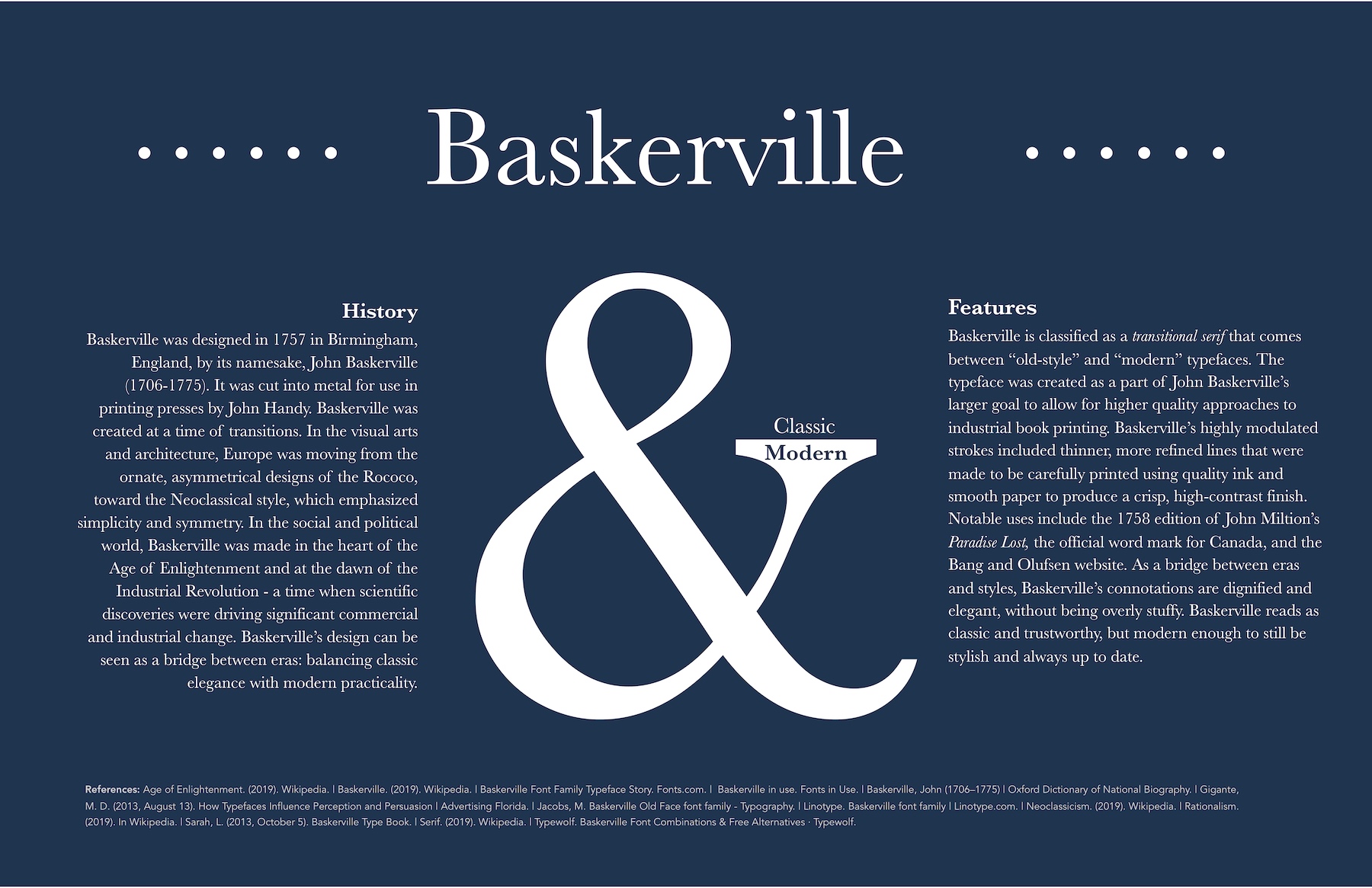
The ampersand character (&) was the first thing that drew me to this typeface, and as I did my research and learned more about it, I realized that "&" communicated so much about Baskerville's history and design features. I really enjoyed trying to figure out how to make "&" the centerpiece of the design, and trying to show how Baskerville comes between and bridges classic and modern styles. I also really liked how well the "&" demonstrated the typographical features that characterize Baskerville. I loved how the right side of the ampersand sort of looked like a hand holding a dinner platter and I wanted to try to play with this idea in the design. I was also interested in trying to evoke Baskerville's middle place on a timeline, using the "..." characters on the left and right sides.
The most challenging part of the design was to try to evoke this balance of classic and modern. I didn't want to push the design too far, as I thought that getting too edgy would take away from Baskerville's connotations - but an exceedingly formal design wouldn't work either. I think the breakthrough came in choosing the color. I went with the primary color in Shepard Fairey's iconic "Hope" poster - trying to evoke a bit of nostalgia for more balanced times.
All in all, this was an amazing course, and I'm hoping to get a chance, at some point, to continue on with other courses in the series on image making and graphic design. Oh, and if you are looking for a version of Baskerville to use online, check out the google font Libre Baskerville.